
- Understanding Design Systems
- Key Components of a Design System
- Implementing a Design System
- Maintaining a Design System
- Overcoming Common Challenges
- The Future of Design Systems
- Adapting Design Systems for Mobile Development
- Leveraging Design Systems for Internationalization
- Incorporating Brand Identity
- Enhancing Collaboration with Design Systems
- Scaling Design Systems
- Leveraging Automation and CI/CD
- Embracing Open Source Design Systems
- Conclusion
In the ever-evolving field of frontend development, consistency and efficiency are paramount. Design systems have emerged as a powerful tool to address these needs, providing a framework that promotes uniformity and streamlines the development process. This article explores the role of design systems in frontend development, examining their benefits, components, and best practices for implementation.
Understanding Design Systems

What is a Design System?
A design system is a collection of reusable components, guided by clear standards, that can be assembled together to build any number of applications. It encompasses a range of elements, from UI components and design tokens to guidelines and best practices.
The goal is to create a cohesive user experience across all digital products of an organization.
Benefits of Design Systems
Design systems offer numerous benefits to frontend development teams:
- Consistency: They ensure a consistent look and feel across all parts of an application, enhancing the user experience.
- Efficiency: Reusable components and predefined styles speed up the development process, reducing redundant work.
- Scalability: Design systems make it easier to scale applications by providing a solid foundation and clear guidelines.
- Collaboration: They facilitate better collaboration between designers and developers, ensuring everyone is on the same page.
- Maintainability: A well-documented design system simplifies maintenance and updates, as changes can be made centrally and propagate throughout the application.
Key Components of a Design System
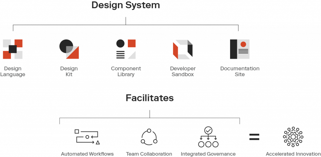
UI Components
UI components are the building blocks of a design system. These are pre-designed and pre-coded elements that can be reused across different parts of the application.
Examples include buttons, forms, modals, and navigation bars. Each component is designed to be flexible and adaptable, ensuring it can fit into various contexts while maintaining a consistent appearance.
Design Tokens
Design tokens are the smallest pieces of a design system, representing values for colors, fonts, spacing, and other design attributes. By using tokens, you can ensure consistency and make it easier to apply changes across the system.
For example, updating a color token will automatically update all instances where that color is used, maintaining a uniform look.
Style Guidelines
Style guidelines outline the visual language of the design system. They cover typography, color schemes, spacing, and other design principles that ensure a cohesive aesthetic.
These guidelines help designers and developers understand how to use the components and design tokens effectively, promoting consistency across the application.
Documentation
Comprehensive documentation is a critical component of a design system. It provides detailed instructions on how to use the components, design tokens, and style guidelines.
Good documentation should include code examples, usage guidelines, and best practices. This ensures that everyone involved in the development process can easily access and understand the design system.
Accessibility Standards
Accessibility is a crucial aspect of any design system. Including accessibility standards ensures that your application is usable by everyone, including people with disabilities. This involves providing guidelines on color contrast, keyboard navigation, screen reader compatibility, and other accessibility considerations.
Implementing a Design System

Planning and Strategy
Implementing a design system requires careful planning and a clear strategy. Start by identifying the core components and design tokens that will form the foundation of your system.
Engage with stakeholders from design, development, and product management to ensure that the system meets the needs of all users.
Building the System
Once the planning phase is complete, start building the components and design tokens. Use a component library or framework that supports your chosen technology stack. Popular options include Storybook, React, Vue, and Angular. Ensure that each component is designed with reusability and flexibility in mind.
Documenting the System
As you build the design system, document each component, design token, and style guideline. Use tools like Storybook or Zeroheight to create interactive documentation that includes live code examples, usage guidelines, and best practices.
This documentation will be invaluable for onboarding new team members and ensuring consistent use of the design system.
Integrating with Your Workflow
Integrate the design system into your development workflow to ensure it is used consistently. This involves incorporating the system into your build process, setting up CI/CD pipelines, and training your team on how to use it effectively.
Regularly review and update the system to accommodate new requirements and improvements.
Promoting Adoption
Promoting adoption of the design system within your organization is crucial for its success. Encourage designers and developers to use the system by demonstrating its benefits, providing training sessions, and offering ongoing support.
Gather feedback from users and continuously refine the system to meet their needs.
Maintaining a Design System
Continuous Improvement
A design system is not a one-time project but an ongoing process. Regular updates and improvements are essential to keep it relevant and effective. This involves:
- Monitoring Usage: Keep track of how the design system is being used across projects. Identify any inconsistencies or issues that arise and address them promptly.
- Gathering Feedback: Regularly solicit feedback from designers, developers, and other stakeholders. Use this feedback to make informed improvements and ensure the system meets the needs of its users.
- Updating Components: As new design trends emerge and user needs evolve, update the UI components and design tokens to reflect these changes. This might involve redesigning existing components or adding new ones.
- Refining Guidelines: Update the style guidelines and documentation to reflect any changes in the design system. Ensure that new team members can easily understand and follow the updated guidelines.
Version Control
Using version control for your design system allows you to track changes, manage updates, and ensure consistency. Tools like Git provide a way to version your design system and roll back changes if necessary.
Maintain a clear versioning strategy (e.g., semantic versioning) to keep track of major, minor, and patch updates.
Governance and Ownership
Establishing clear governance and ownership of the design system is crucial for its success. Assign a dedicated team or individual responsible for maintaining and updating the system. This team should be responsible for:
- Reviewing Contributions: Assess contributions from other team members to ensure they align with the overall design system.
- Enforcing Standards: Ensure that all projects adhere to the design system’s guidelines and standards.
- Providing Support: Offer support and guidance to designers and developers using the system, helping them troubleshoot issues and implement best practices.
Integration with Design Tools
Integrating your design system with popular design tools like Figma, Sketch, or Adobe XD can streamline the workflow for designers. These tools allow designers to access the design system directly within their design environment, making it easier to use the predefined components and styles.
This integration helps maintain consistency and speeds up the design process.
Cross-Team Collaboration
Encouraging collaboration between different teams is essential for the success of a design system. Facilitate regular meetings, workshops, and discussions to ensure everyone is aligned and can share their insights.
Collaboration helps identify common challenges, align on best practices, and foster a culture of continuous improvement.
Measuring Success
Measuring the success of your design system involves tracking key metrics that reflect its impact on your projects. These metrics can include:
- Adoption Rate: Track how many projects and team members are using the design system.
- Consistency: Monitor the consistency of the design across different parts of your application. Use automated tools to check for adherence to the design system.
- Efficiency: Measure the time saved by using reusable components and predefined styles. Track the reduction in redundant work and the speed of new feature development.
- User Satisfaction: Gather feedback from both internal users (designers and developers) and external users (end-users) to assess the satisfaction with the design system.
Overcoming Common Challenges
Resistance to Change
One of the most common challenges when implementing a design system is resistance to change. Team members may be accustomed to their existing workflows and hesitant to adopt new practices. Overcoming this resistance involves:
- Education and Training: Provide comprehensive training sessions to demonstrate the benefits of the design system and how to use it effectively.
- Showcasing Benefits: Highlight the efficiency gains, consistency, and improved user experience that the design system can bring.
- Gradual Implementation: Introduce the design system gradually, starting with a few key components and expanding over time.
Maintaining Flexibility
A design system needs to strike a balance between consistency and flexibility. Too rigid a system can stifle creativity and fail to meet unique project needs. To maintain flexibility:
- Customizable Components: Design components to be easily customizable, allowing teams to adjust them to fit specific requirements.
- Clear Guidelines: Provide guidelines on how to extend and modify components while maintaining consistency.
- Regular Updates: Continuously update the design system to incorporate feedback and accommodate new use cases.
Ensuring Accessibility
Ensuring that your design system is accessible to all users, including those with disabilities, is a critical challenge. Overcome this by:
- Inclusive Design: Incorporate accessibility considerations into the design process from the beginning.
- Testing and Validation: Regularly test components for accessibility using automated tools and real user testing.
- Clear Documentation: Provide clear documentation on accessibility standards and how to implement them in your projects.
The Future of Design Systems

Integration with AI and Machine Learning
The future of design systems may involve greater integration with AI and machine learning. These technologies can automate aspects of the design process, such as generating components based on user behavior data or predicting the most effective design patterns. This can further enhance efficiency and personalization.
Evolving Design Principles
As design principles and user expectations evolve, design systems will need to adapt. Staying updated with the latest trends and incorporating them into your design system will ensure it remains relevant and effective. This may involve embracing new design aesthetics, interaction patterns, and technologies.
Enhanced Collaboration Tools
Advances in collaboration tools will continue to improve the way design systems are developed and maintained. Tools that facilitate real-time collaboration between designers and developers, such as Figma and Storybook, will become increasingly sophisticated, making it easier to create and manage design systems.
Greater Focus on Sustainability
Sustainability is becoming an important consideration in many aspects of business, including design. Future design systems may incorporate principles of sustainable design, focusing on creating digital products that are not only user-friendly and efficient but also environmentally responsible.
Adapting Design Systems for Mobile Development
Mobile-First Approach
In today’s digital landscape, a significant portion of web traffic comes from mobile devices. Adopting a mobile-first approach when developing your design system ensures that your application provides an optimal experience on smaller screens.
This approach involves designing the mobile version of your components first and then scaling them up for larger screens.
Responsive Design Principles
Responsive design is crucial for creating applications that work well on a variety of devices. Ensure your design system includes responsive design principles, such as flexible grids, fluid images, and media queries. Define breakpoints that guide how components should adjust across different screen sizes.
Example of responsive design using CSS media queries:
/* Mobile styles */
.card {
  width: 100%;
  padding: 16px;
}

/* Tablet styles */
@media (min-width: 768px) {
  .card {
    width: 75%;
    padding: 24px;
  }
}

/* Desktop styles */
@media (min-width: 1024px) {
  .card {
    width: 50%;
    padding: 32px;
  }
}
Touch-Friendly Components
Mobile users interact with applications through touch, so it’s essential to design components that are touch-friendly. Ensure buttons, links, and other interactive elements are large enough to be easily tapped, and include appropriate spacing to prevent accidental taps.
Performance Optimization for Mobile
Mobile devices often have less processing power and slower internet connections compared to desktops. Optimize your design system for performance by minimizing the use of heavy assets, reducing the number of HTTP requests, and leveraging techniques like lazy loading and image optimization.
Testing on Real Devices
To ensure your design system performs well on mobile devices, test it on a variety of real devices. Emulators and simulators are useful, but testing on actual devices helps identify issues that may not be apparent otherwise. Pay attention to performance, touch responsiveness, and visual appearance.
Leveraging Design Systems for Internationalization

Supporting Multiple Languages
A global user base requires support for multiple languages. Your design system should accommodate text expansion and contraction that occurs with different languages. Ensure that your components are flexible enough to handle longer strings without breaking the layout.
Right-to-Left (RTL) Support
Some languages, such as Arabic and Hebrew, are read from right to left. Your design system should include support for RTL layouts to provide a good user experience for these languages. This involves mirroring the layout and ensuring that components adapt correctly.
Example of RTL support using CSS:
body {
  direction: ltr;
}

body[dir="rtl"] {
  direction: rtl;
}

.card {
  padding-left: 16px;
}

body[dir="rtl"] .card {
  padding-right: 16px;
  padding-left: 0;
}
Date and Time Formats
Different regions have different conventions for displaying dates and times. Your design system should include support for various date and time formats to ensure clarity and usability for users worldwide. Use libraries like Moment.js or the Internationalization API to handle these variations.
Example of using the Internationalization API:
const date = new Date();
const options = { year: 'numeric', month: 'long', day: 'numeric' };
const formattedDate = new Intl.DateTimeFormat('en-US', options).format(date);
console.log(formattedDate); // Output: December 17, 2021

const formattedDateRTL = new Intl.DateTimeFormat('ar-EG', options).format(date);
console.log(formattedDateRTL); // Output: ١٧ ديسمبر ٢٠٢١
Cultural Sensitivity
Designing for a global audience requires cultural sensitivity. Ensure that the imagery, icons, and color schemes used in your design system are appropriate and respectful for different cultures. Avoid symbols or colors that may have negative connotations in certain regions.
Incorporating Brand Identity
Consistent Branding
A design system should reflect the brand identity of your organization. Consistent branding across all components and styles helps build a strong, recognizable brand presence. Define brand colors, typography, and logo usage guidelines as part of your design system.
Customization for Brand Variants
If your organization manages multiple brands or sub-brands, your design system should support customization for different brand identities. This can involve creating separate themes or variants within the design system that apply different color schemes, fonts, and styles.
Example of customizing themes:
/* Default theme */
:root {
  --primary-color: #6200ea;
  --secondary-color: #03dac5;
  --font-family: 'Roboto', sans-serif;
}

/* Brand variant theme */
[data-theme="brand-variant"] {
  --primary-color: #ff5722;
  --secondary-color: #ffeb3b;
  --font-family: 'Arial', sans-serif;
}
Evolving Brand Identity
Brands evolve over time, and your design system should be flexible enough to accommodate these changes. Regularly review and update the design system to reflect any changes in the brand’s visual identity, ensuring that all components stay aligned with the latest brand guidelines.
Enhancing Collaboration with Design Systems
Bridging the Gap Between Designers and Developers
A well-implemented design system enhances collaboration between designers and developers. By providing a shared language and set of tools, it ensures that both teams are aligned and can work together more effectively. Regular communication and joint workshops can further strengthen this collaboration.
Using Design Tokens
Design tokens are a powerful tool for bridging the gap between design and development. They represent design decisions in a way that both designers and developers can use. For example, colors, spacing, and typography can be defined as tokens and used consistently across design tools and codebases.
Example of design tokens:
{
  "color-primary": "#6200ea",
  "color-secondary": "#03dac5",
  "font-family-base": "'Roboto', sans-serif",
  "spacing-small": "8px",
  "spacing-medium": "16px",
  "spacing-large": "32px"
}
Implementing Feedback Loops
Establishing feedback loops between designers and developers ensures that the design system evolves based on practical use and real-world requirements. Regular reviews and retrospective meetings can help identify areas for improvement and ensure that the system continues to meet the needs of both teams.
Scaling Design Systems

Managing Component Libraries
As your application grows, managing a large number of components can become challenging. Use component libraries and frameworks to organize and manage your components effectively.
Tools like Storybook can help document and showcase your component library, making it easier for team members to find and use components.
Automating Documentation
Maintaining up-to-date documentation is crucial for the success of a design system. Automation tools can help generate and update documentation based on your codebase, ensuring that the documentation is always current and accurate. Integrate documentation tools like Styleguidist or Docz into your build process.
Scaling Across Teams
In large organizations, multiple teams may use the same design system. Ensure that the system is scalable and can accommodate the needs of different teams. Provide clear guidelines on how to extend and customize the system, and establish a governance model to manage contributions and updates.
Globalization and Localization
Scaling a design system globally involves addressing localization requirements and ensuring that the system can support multiple languages, regions, and cultural contexts.
This includes defining localization guidelines, supporting RTL layouts, and ensuring that components are flexible enough to handle different content lengths and formats.
Leveraging Automation and CI/CD
Automating Component Testing
Automated testing is crucial for maintaining the integrity of your design system. Use tools like Jest and Cypress to write unit and integration tests for your components. Automated tests ensure that changes to components do not introduce regressions or break existing functionality.
Example of a simple Jest test:
import React from 'react';
import { render } from '@testing-library/react';
import Button from './Button';

test('renders button with correct text', () => {
  const { getByText } = render(<Button>Click me</Button>);
  const buttonElement = getByText(/click me/i);
  expect(buttonElement).toBeInTheDocument();
});
Continuous Integration and Deployment
Integrate your design system with a CI/CD pipeline to automate the build, testing, and deployment processes. This ensures that changes to the design system are thoroughly tested and deployed consistently. Tools like GitHub Actions, CircleCI, and Jenkins can help set up CI/CD pipelines for your design system.
Automating Visual Regression Testing
Visual regression testing helps ensure that updates to the design system do not unintentionally alter the appearance of components.
Use tools like Percy, Chromatic, or Applitools to automate visual regression tests. These tools capture screenshots of your components and compare them against a baseline to identify visual differences.
Example of using Percy with Storybook:
npx percy exec -- storybookEmbracing Open Source Design Systems
Learning from Open Source Projects
Open source design systems like Material Design, Ant Design, and Carbon Design System provide valuable insights and inspiration. Study these projects to understand how they structure their components, manage documentation, and address accessibility. Applying these lessons can help improve your own design system.
Contributing to Open Source
Contributing to open source design systems allows you to collaborate with other designers and developers, share your expertise, and learn from the community. It also helps you stay updated with the latest trends and best practices in design system development.
Adopting Open Source Tools
Leverage open source tools and libraries to build and manage your design system. Tools like Storybook, Styleguidist, and Figma offer powerful features and are widely used in the industry. Adopting these tools can streamline your workflow and enhance the capabilities of your design system.
Conclusion
Design systems play a crucial role in frontend development, offering numerous benefits such as consistency, efficiency, scalability, and improved collaboration. By understanding the components of a design system and following best practices for implementation and maintenance, you can create a robust framework that enhances the quality and usability of your digital products. As technology and design principles evolve, staying adaptable and continuously improving your design system will ensure it remains a valuable asset for your organization.
Read Next:


