
- Understanding Cross-Browser Compatibility
- Best Practices for Ensuring Cross-Browser Compatibility
- Advanced Techniques for Cross-Browser Compatibility
- Tools and Resources for Cross-Browser Compatibility
- The Future of Cross-Browser Compatibility
- Adapting to Browser-Specific Features
- Emphasizing Performance Optimization
- Enhancing Security Across Browsers
- User Feedback and Error Handling
- Monitoring and Analytics
- Conclusion
In today’s digital world, users access websites through a myriad of browsers, devices, and platforms. Ensuring that your website works seamlessly across all of these variations is crucial for delivering a consistent user experience. This is where cross-browser compatibility comes into play. Achieving cross-browser compatibility means that your site looks and functions well on any browser, whether it’s Chrome, Firefox, Safari, Edge, or even older versions of Internet Explorer. This article will explore best practices for achieving cross-browser compatibility, focusing on actionable steps you can take to ensure your website performs optimally for all users.
Understanding Cross-Browser Compatibility

The Importance of Cross-Browser Compatibility
Cross-browser compatibility ensures that your website delivers a consistent user experience, no matter which browser or device your visitors use. This is vital for several reasons:
- User Experience: Users expect a seamless experience across all devices and browsers. If your site works well on one browser but not another, users might become frustrated and leave.
- Reach and Accessibility: Different users prefer different browsers. Ensuring compatibility means you’re not alienating any segment of your audience.
- SEO Benefits: Search engines prioritize user experience. If your site has compatibility issues, it could affect your search rankings.
Common Browser Compatibility Issues
Several common issues can affect cross-browser compatibility. Understanding these can help you anticipate and address potential problems:
- CSS Styling Differences: Different browsers interpret CSS rules slightly differently. This can lead to layout and design inconsistencies.
- JavaScript Compatibility: Some JavaScript features or methods may not be supported in older browsers or may work differently across browsers.
- HTML5 and CSS3 Features: While modern browsers support most HTML5 and CSS3 features, older browsers may not, leading to functional discrepancies.
- Vendor Prefixes: Some CSS properties require vendor-specific prefixes to work in different browsers, which can lead to inconsistent behavior if not implemented correctly.
Best Practices for Ensuring Cross-Browser Compatibility
Use Standardized Code
One of the fundamental practices for ensuring cross-browser compatibility is to use standardized, validated code. HTML, CSS, and JavaScript all have standardized versions maintained by organizations like W3C. By adhering to these standards, you reduce the likelihood of encountering compatibility issues.
Validate Your Code
Validation tools can help you check your HTML, CSS, and JavaScript for errors and standards compliance. Using tools like the W3C Markup Validation Service for HTML and CSS, and JSHint or ESLint for JavaScript, can catch issues early in the development process.
Embrace Progressive Enhancement
Progressive enhancement is a design strategy that focuses on building a baseline experience for all users and then enhancing it for those with more capable browsers.
Start with a solid HTML foundation, add basic CSS for styling, and then layer on JavaScript enhancements. This approach ensures that your site remains functional even if some features are not supported by older browsers.
Use Feature Detection
Instead of relying on browser detection, which can be unreliable, use feature detection to determine if a browser supports a particular feature. Libraries like Modernizr can help you implement feature detection, allowing you to apply fallbacks or polyfills where necessary.
Test Across Multiple Browsers
Regularly testing your site across different browsers and devices is crucial. This includes not only the latest versions of popular browsers but also older versions and less common browsers. Tools like BrowserStack and Sauce Labs provide access to a wide range of browsers and devices for comprehensive testing.
Utilize CSS Resets and Normalization
CSS resets and normalization libraries help mitigate browser inconsistencies by providing a consistent baseline for styling. While a CSS reset removes all default styling, normalization retains useful defaults but ensures consistency across browsers.
Avoid Browser-Specific Hacks
While it might be tempting to use browser-specific hacks to solve compatibility issues, this approach can lead to maintenance headaches and more problems down the line. Instead, focus on writing clean, standards-compliant code and use feature detection and polyfills to address issues.
Advanced Techniques for Cross-Browser Compatibility
Polyfills and Transpilers

Polyfills are scripts that replicate the functionality of newer web features in older browsers that do not support them. For example, you can use a polyfill to add support for HTML5 elements in Internet Explorer 8. Similarly, transpilers like Babel can convert modern JavaScript code into a version compatible with older browsers.
Responsive Design and Flexibility
With the proliferation of mobile devices, responsive design has become essential. Ensure that your layout adapts to different screen sizes and orientations. Using flexible grid systems, responsive images, and media queries helps maintain compatibility across various devices and browsers.
Debugging Tools and Techniques
Effective debugging is essential for resolving cross-browser compatibility issues. Modern browsers come with powerful developer tools that can help you inspect and debug HTML, CSS, and JavaScript. Learning how to use these tools effectively can save time and effort in identifying and fixing issues.
Performance Optimization
Performance is a crucial aspect of cross-browser compatibility. Optimized code not only ensures better performance but also reduces the chances of encountering compatibility issues. Minify your CSS and JavaScript, optimize images, and leverage caching to improve site performance.
Version Control and Cross-Browser Testing
Using version control systems like Git is crucial for managing changes and collaborating with team members. Integrating version control with cross-browser testing ensures that every change made to the codebase is tested across multiple browsers before deployment.
This practice helps catch compatibility issues early in the development cycle.
Setting Up Continuous Integration (CI)
Implementing a CI pipeline that includes automated cross-browser testing can significantly streamline the development process. Tools like Travis CI, CircleCI, and GitHub Actions can be configured to run tests on various browsers every time code is pushed to the repository.
This ensures that compatibility issues are detected and resolved promptly.
Keeping Up with Browser Updates
Browsers are continuously updated, introducing new features and deprecating old ones. Staying informed about these changes is essential for maintaining cross-browser compatibility. Follow browser release notes, participate in web development communities, and subscribe to relevant newsletters to stay updated.
Tools and Resources for Cross-Browser Compatibility
Ensuring cross-browser compatibility can be a daunting task, but using the right tools and resources can significantly simplify the process. These tools help you test, debug, and optimize your website across different browsers and devices, ensuring a consistent and high-quality user experience.
Here, we will explore various tools and resources that can aid businesses in achieving cross-browser compatibility, along with strategic advice on how to utilize them effectively.
Comprehensive Testing Platforms
BrowserStack

BrowserStack is a widely-used cross-browser testing tool that provides access to real browsers and devices for testing. It allows developers to perform manual and automated tests across a wide range of browsers, operating systems, and devices. This ensures that your website performs consistently for all users.
To get the most out of BrowserStack, integrate it into your continuous integration (CI) pipeline. This enables automatic testing every time code is pushed to the repository, catching compatibility issues early in the development process.
Setting up automated tests using Selenium or other testing frameworks with BrowserStack ensures thorough and efficient testing.
Sauce Labs

Sauce Labs offers a comprehensive testing platform for web and mobile applications, providing a vast array of browser and device combinations. It supports both manual and automated testing, helping you identify and fix compatibility issues.
Using Sauce Labs, you can conduct parallel tests, which saves time and speeds up the development process. Integrate Sauce Labs with your CI/CD pipeline to ensure that every build is tested across all target browsers and devices.
This proactive approach helps maintain a high standard of compatibility and user experience.
Development and Debugging Tools
Chrome DevTools
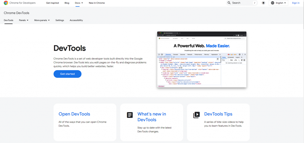
Chrome DevTools is a powerful suite of tools built directly into the Google Chrome browser. It allows developers to inspect and debug HTML, CSS, and JavaScript in real-time.
Chrome DevTools provides a range of features, including device mode for responsive design testing, performance monitoring, and network analysis.
To leverage Chrome DevTools effectively, regularly use the device mode to simulate different screen sizes and resolutions. This helps ensure that your site is responsive and looks good on all devices.
Additionally, utilize the performance monitoring features to identify and resolve performance bottlenecks that could affect different browsers.
Firefox Developer Tools

Firefox Developer Tools offer similar capabilities to Chrome DevTools, with additional features like CSS Grid Inspector and JavaScript Debugger. These tools help developers ensure their websites work seamlessly across all versions of Firefox.
Incorporate Firefox Developer Tools into your regular development workflow. Use the CSS Grid Inspector to debug layout issues and ensure that your design works consistently across browsers. The JavaScript Debugger can help identify compatibility issues related to JavaScript, allowing for more precise debugging and faster resolution.
Code Validation and Optimization Tools
W3C Markup Validation Service

The W3C Markup Validation Service checks the validity of your HTML, XHTML, and other markup languages. Validating your code ensures it adheres to web standards, reducing the likelihood of compatibility issues.
Make it a habit to validate your code regularly using this service. Integrate it into your development workflow to catch errors early and ensure that your markup is standards-compliant. This proactive approach helps maintain a clean and robust codebase.
Autoprefixer

Autoprefixer is a tool that automatically adds vendor prefixes to your CSS, ensuring compatibility with different browsers. It parses your CSS and adds the necessary prefixes, reducing the need for manual adjustments.
To implement Autoprefixer, integrate it into your build process using tools like Gulp, Grunt, or Webpack. This ensures that your CSS is always up-to-date with the latest vendor prefixes, improving cross-browser compatibility without additional manual effort.
Feature Detection and Polyfills
Modernizr

Modernizr is a JavaScript library that detects HTML5 and CSS3 features in the user’s browser. It enables you to conditionally apply polyfills or alternative styles based on the browser’s capabilities, ensuring a consistent experience across all browsers.
Incorporate Modernizr into your development process to handle feature detection. Use it to apply fallbacks and polyfills only when necessary, optimizing performance and compatibility. This approach ensures that your site remains functional and visually consistent for all users.
Polyfill.io
Polyfill.io is a service that provides polyfills for browser features that are not natively supported. By including a single script, Polyfill.io detects the features needed by the user’s browser and loads only the necessary polyfills.
Utilize Polyfill.io to streamline the process of adding polyfills to your site. This service reduces the overhead of manually managing polyfills and ensures that only the required ones are loaded, optimizing performance and compatibility.
Responsive Design and Layout Tools
Bootstrap

Bootstrap is a popular front-end framework that simplifies the development of responsive and cross-browser compatible websites. It includes a grid system, pre-styled components, and JavaScript plugins, ensuring a consistent design across different browsers and devices.
To maximize the benefits of Bootstrap, customize the framework to fit your project’s needs. Use Bootstrap’s grid system to create flexible and responsive layouts, and leverage its components to maintain design consistency.
Regularly update to the latest version of Bootstrap to take advantage of new features and improvements.
CSS Grid Layout

CSS Grid Layout is a powerful layout system supported by most modern browsers. It allows for complex and responsive layouts with less code compared to traditional methods.
Incorporate CSS Grid into your design process to create flexible and responsive layouts. Use the CSS Grid Inspector in Firefox Developer Tools or Chrome DevTools to visualize and debug grid layouts. This approach ensures that your layouts are consistent across different browsers and devices.
Performance Monitoring and Analytics
Google Lighthouse

Google Lighthouse is an open-source tool that audits your website for performance, accessibility, SEO, and best practices. It provides actionable insights to improve your site’s quality across different browsers.
Regularly run Lighthouse audits to identify and address performance issues. Use the reports to make informed decisions on optimizing your site’s performance and compatibility. Integrating Lighthouse into your CI pipeline ensures continuous monitoring and improvement.
New Relic

New Relic offers performance monitoring and analytics for web applications. It provides detailed insights into your site’s performance across different browsers and devices, helping you identify and resolve issues.
Leverage New Relic to monitor real user interactions and performance metrics. Use the data to pinpoint compatibility issues and optimize your site accordingly. This proactive approach ensures a high level of performance and user satisfaction.
Strategic Advice for Businesses
Establishing a Cross-Browser Compatibility Workflow
Creating a structured workflow for cross-browser compatibility ensures that it becomes an integral part of your development process. Define clear steps for testing, validation, and optimization, and ensure that all team members are aware of these procedures.
Start by setting up a testing environment that includes a variety of browsers and devices. Integrate cross-browser testing tools into your CI pipeline to automate the process and catch issues early. Regularly review and update your workflow to incorporate new tools and best practices.
Training and Knowledge Sharing
Investing in training and knowledge sharing helps your team stay updated with the latest trends and techniques in cross-browser compatibility. Conduct regular workshops, webinars, and training sessions to keep your team informed.
Encourage team members to share their experiences and solutions for cross-browser issues. Create a knowledge base or internal documentation to capture best practices and lessons learned.
This collaborative approach fosters a culture of continuous improvement and ensures that everyone is equipped to handle compatibility challenges.
Prioritizing User Experience
Ultimately, the goal of achieving cross-browser compatibility is to provide a seamless and consistent user experience. Prioritize user experience by regularly collecting and analyzing user feedback. Use this feedback to identify areas for improvement and make informed decisions.
Conduct user testing to gather insights into how different browsers and devices affect the user experience. Use these insights to prioritize fixes and enhancements that have the most significant impact on your audience.
By focusing on user experience, you ensure that your efforts in cross-browser compatibility translate into tangible benefits for your users and your business.
The Future of Cross-Browser Compatibility
The Role of Web Standards
As web technologies evolve, the importance of adhering to web standards becomes even more critical. Organizations like the W3C and WHATWG work to establish and maintain these standards, ensuring that browsers implement features consistently.
By following these standards, developers can create websites that are more likely to be compatible across different browsers and devices.
The Impact of JavaScript Frameworks
JavaScript frameworks like React, Angular, and Vue.js have become increasingly popular in web development. These frameworks often come with built-in tools and best practices for ensuring cross-browser compatibility. However, it’s essential to remain vigilant and test your applications thoroughly, as even these frameworks can have compatibility issues.
Progressive Web Apps (PWAs)
Progressive Web Apps represent the future of web development, combining the best features of web and mobile applications. PWAs are designed to work on any browser and provide a seamless user experience across all devices.
By following PWA principles, developers can ensure that their applications are not only compatible but also performant and engaging.
Adapting to Browser-Specific Features
Understanding Vendor-Specific Extensions
Browsers often implement new CSS and JavaScript features using vendor-specific prefixes before they become standardized. These prefixes allow developers to use cutting-edge features before they are fully adopted. Understanding and using these prefixes correctly can help ensure compatibility while providing advanced functionality.
Example of Vendor Prefixes
For instance, different browsers might use different prefixes for certain CSS properties:
-webkit-for Chrome and Safari-moz-for Firefox-o-for Opera-ms-for Internet Explorer
/* Example of vendor prefixes for CSS transitions */
.element {
  -webkit-transition: all 0.3s ease;
  -moz-transition: all 0.3s ease;
  -o-transition: all 0.3s ease;
  transition: all 0.3s ease;
}
Conditional Loading of Scripts and Styles
In some cases, it might be necessary to load different scripts or stylesheets based on the browser. Conditional loading ensures that users get the best possible experience based on their browser’s capabilities.
Implementing Conditional Loading
You can use JavaScript to detect the browser and conditionally load scripts or styles:
// Example of conditional script loading
if (navigator.userAgent.indexOf('MSIE') !== -1 || !!document.documentMode) {
  // Load IE-specific script
  var script = document.createElement('script');
  script.src = 'ie-specific-script.js';
  document.head.appendChild(script);
} else {
  // Load modern browser script
  var script = document.createElement('script');
  script.src = 'modern-browser-script.js';
  document.head.appendChild(script);
}
Emphasizing Performance Optimization
Critical Rendering Path Optimization
The critical rendering path involves the sequence of steps the browser takes to render a web page. Optimizing this path can significantly improve page load times and overall performance, especially important for ensuring a smooth experience across all browsers.
Techniques for Optimization
- Minimize Render-Blocking Resources: Reduce or eliminate CSS and JavaScript that block the initial render.
- Defer Non-Essential JavaScript: Use
asyncordeferattributes to load non-essential scripts after the initial content has rendered. - Inline Critical CSS: Place critical CSS directly in the HTML to speed up the first paint.
Resource Prioritization
Properly prioritizing resources can enhance the user experience, particularly on slower connections or less powerful devices. This includes optimizing images, scripts, and styles to load in the most efficient order.
Implementing Resource Prioritization
Use techniques like preloading, prefetching, and lazy loading to prioritize important resources:
<!-- Preload key resources -->
<link rel="preload" href="styles.css" as="style">
<link rel="preload" href="script.js" as="script">
<link rel="preload" href="image.jpg" as="image">
// Lazy loading images
document.addEventListener('DOMContentLoaded', function() {
const lazyImages = document.querySelectorAll('img.lazy');
lazyImages.forEach(img => {
img.src = img.dataset.src;
img.classList.remove('lazy');
});
});Enhancing Security Across Browsers
Secure Coding Practices
Security is paramount, and ensuring that your website is secure across all browsers is essential. Adopting secure coding practices helps protect your site from vulnerabilities that could be exploited differently across various browsers.
Key Security Practices
- Content Security Policy (CSP): Implement CSP headers to prevent cross-site scripting (XSS) and other code injection attacks.
- Secure Cookies: Use the
HttpOnlyandSecureflags to protect cookies from being accessed via JavaScript and ensure they are transmitted over HTTPS. - HTTPS Everywhere: Serve your site over HTTPS to ensure data integrity and privacy.
<!-- Example of setting a Content Security Policy -->
<meta http-equiv="Content-Security-Policy" content="default-src 'self'; script-src 'self' https://trusted-scripts.com;">
Browser Security Features
Different browsers offer various security features and settings. Being aware of these and ensuring your site leverages them appropriately can enhance security for all users.
Example of Browser Security Settings
- SameSite Cookies: Set the
SameSiteattribute on cookies to prevent cross-site request forgery (CSRF) attacks. - Referrer Policy: Use the
Referrer-Policyheader to control how much referrer information is sent with requests.
<!-- Setting a referrer policy -->
<meta name="referrer" content="no-referrer">
User Feedback and Error Handling

Capturing User Feedback
User feedback is invaluable for identifying and resolving cross-browser compatibility issues. Encouraging users to report issues they encounter can provide insights into problems that might not be caught during testing.
Implementing Feedback Mechanisms
Incorporate feedback forms or bug report links on your site to make it easy for users to report issues:
<!-- Example feedback form -->
<form action="/submit-feedback" method="post">
  <label for="feedback">Report an issue:</label>
  <textarea id="feedback" name="feedback" required></textarea>
  <button type="submit">Submit</button>
</form>
Graceful Error Handling
When issues do occur, handling errors gracefully ensures that users are not left with a broken or unusable site. Implementing user-friendly error messages and fallbacks can maintain a positive user experience even when something goes wrong.
Example of Error Handling
Use JavaScript to catch and handle errors, providing helpful feedback to the user:
window.onerror = function(message, source, lineno, colno, error) {
  console.error('Error occurred:', message, 'at', source, lineno + ':' + colno);
  alert('An unexpected error occurred. Please try again later.');
};
Monitoring and Analytics
Implementing Monitoring Tools
Continuous monitoring helps identify and resolve compatibility issues as they arise. Tools like Google Analytics, New Relic, and Sentry can provide insights into how your site performs across different browsers and devices.
Example of Setting Up Monitoring
Configure these tools to track errors, performance metrics, and user behavior:
// Example using Google Analytics
window.ga=window.ga||function(){(ga.q=ga.q||[]).push(arguments)};
ga('create', 'UA-XXXXX-Y', 'auto');
ga('send', 'pageview');

// Track specific errors
window.addEventListener('error', function(event) {
  ga('send', 'event', 'Error', event.message, event.filename + ':' + event.lineno);
});
Analyzing Data for Insights
Regularly review the data collected from monitoring tools to identify patterns and common issues. This analysis can guide your efforts to improve cross-browser compatibility and enhance user experience.
Example of Data Analysis
Use the insights gained from monitoring to prioritize fixes and enhancements:
- Identify the most common browsers and devices used by your audience.
- Focus on resolving issues that affect a significant portion of your users.
- Implement changes incrementally and monitor their impact.
Conclusion
Cross-browser compatibility is a vital aspect of web development that ensures your website provides a consistent and high-quality experience for all users. By adhering to best practices, utilizing advanced techniques, and leveraging the right tools, you can overcome compatibility challenges and deliver a seamless experience across all browsers.
A consistent user experience across all browsers enhances user satisfaction, reduces bounce rates, and improves SEO performance. By investing in cross-browser compatibility, you not only make your website more accessible but also build trust and credibility with your audience.
The web development landscape is continuously evolving, with new technologies and browser updates emerging regularly. Staying informed and adapting to these changes is crucial for maintaining cross-browser compatibility. By following the strategies outlined in this article, you can ensure that your website remains compatible, performant, and future-proof.
READ NEXT:


